Posts

Showing posts from 2020

Module 6: Proportional Symbol and Bivariate Choropleth Mapping
Image
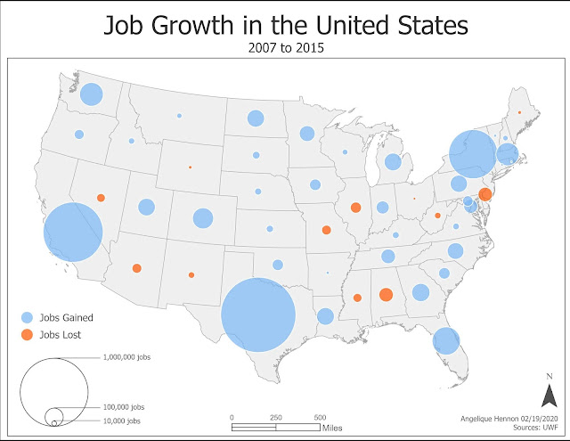
The objectives of this week's lab was to explore proportional symbol and bivariate choropleth mapping techniques, as well as customizing legends for each technique. One of the data sets for this lab included positive and negative values. The final map utilizes proportional symbols to show both positive and negative values. This map is essentially two proportional symbol maps overlaid on each other, one for positive job growth and another for negative job growth, with the symbols for both variables sized the same. Utilizing proportional symbols to show both positive and negative values is an effective way to visualize areas that show the greatest and lowest values. These areas are easy to see quickly on the map and give the map reader a simple way to visualize the variable being mapped. Fig 1. Proportional symbol map using positive and negative values.  Another data set for this lab examined contained two data variables: percent of the US population in each state that is obe

Module 5: Analytical Data

Image
The purpose of this week's lab was to practice using a number of different data visualization techniques to combine maps and graphics on an infographic. I chose to show the relationship between food insecurity and obesity based on 2018 data from the County Health Rankings National Data. Food insecurity is being without reliable access to sufficient quantities of affordable, nutritious food. Without access to affordable, nutritious foods, households often have to choose between amount or quality of food. Often the most affordable foods available in high quantities are cheap, processed foods high in fats and sugars and low in nutrition. There is a relationship between eating low quality food and obesity. This means there is possibly a link between food insecurity and obesity. Because obesity is increasing in the US, it is important to find relationships which could explain some of the causes of obesity. Below is my final infographic showing these two variables. Fig 1. Infographic

Module 4: Color Concepts & Choropleth Mapping

Image
In this week's lab, I explored using color and selecting color ramps in ColorBrewer, as well as applying these concepts to create meaningful choropleth maps. I created a map of population change from 2010 to 2014 in Georgia counties. I normalized the data and produced a choropleth map of population change using a diverging color scheme with 6 classes divided around a midpoint of 0. Fig 1. Choropleth map of population change in Georgia counties using a diverging color scheme. For the Georgia population data set, I chose to divide the data set into 6 classes around a midpoint of 0: 3 showing a decrease in population and 3 showing an increase in the population. The classes were grouped based on a manual classification closely based on the Natural Break classification, where the midpoint was adjusted to 0 with the other groups unchanged. Natural Breaks classification creates classes based on similarities in values in the data, thereby revealing patterns in the data. By adjust

Module 3: Terrain Visualization

Image
In this week's lab, I experimented with different methods to visualize terrain, with emphasis on contours and hillshading of DEMs. I used hillshade to support the visualization of landcover in Yellowstone National Park. For this map, I created a multidirectional hillshade from a DEM of the area. Multidirectional hillshade uses multiple imaginary light sources for all sides of the map so that all the terrain receives sufficient shading. This type of hillshade shows relative relief better on a map. For the land cover types, I combined types that were the same, e.g. three types of Douglas Fir,  several types of Lodgepole Pine, and several types of Whitebark Pine, respectively. I created a custom symbology for the land cover types to create visual contrast so that each type could be clearly seen and distinguished on the map. I placed the hillshade under the landcover layer and changed the transparency of the landcover to 50% so that the terrain could be visualized. The rest of the req

Module 2: Coordinate Systems

Image
In this week's lab I explore different coordinate systems and projections in order to better understand the nature of distortions introduced by the systems. For the last part of the lab, I was tasked with selecting a state in the contiguous US and selecting an appropriate projection for the area. I selected the state of Wyoming as my area of interest. Wyoming has 4 State Plane zones and two UTM zones, so neither a single State Plane nor UTM system would work for this area without distorting the size or shape of the state. Therefore, the best coordinate system for this area is Custom Coordinate system. I chose NAD 1983 WyLam (Meters), a custom system specifically for the state of Wyoming, as the projected coordinate system. This coordinate system is a Lambert secant-case normal-aspect conic type projection which preserves shape and is appropriate for a general reference map. The standard parallels are placed at 41N and 45N, the boundaries of the state of Wyoming, which minimizes

Module 1: Map Design & Typography

Image
For this week's lab, I explore symbology and typography to create effective maps. Creating effective maps means applying the 5 map design principles to improve map products. The 5 map design principles are visual contrast, legibility, figure-ground orientation, hierarchical organization and balance. For this lab, I created 5 maps, exploring different tools in applying the map principles.  One of those maps I created is below. This is a map of some recreation sites in the City of Austin designed for a general audience with an interest in tourism to be published in a brochure or small poster.  Map of recreation sites for the City of Austin. I applied the 5 map design principles in this map so that they were complementary and resulted in a simple, easy to read basic map of recreation sites in and around the City of Austin. Below, I describe how I addressed each principle in the map. Visual Contrast: This is how map features and elements contrast with each other and