Module 1: Map Design & Typography
For this week's lab, I explore symbology and typography to create effective maps. Creating effective maps means applying the 5 map design principles to improve map products. The 5 map design principles are visual contrast, legibility, figure-ground orientation, hierarchical organization and balance. For this lab, I created 5 maps, exploring different tools in applying the map principles.
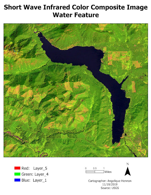
One of those maps I created is below. This is a map of some recreation sites in the City of Austin designed for a general audience with an interest in tourism to be published in a brochure or small poster.
 |
| Map of recreation sites for the City of Austin. |
I applied the 5 map
design principles in this map so that they were complementary and resulted in a
simple, easy to read basic map of recreation sites in and around the City of
Austin. Below, I describe how I addressed each principle in the map.
- Visual Contrast: This is how map features and elements contrast with each other and their background. I chose to make the County Boundary polygon clear so the background would be white, allowing the other data layers to stand out. I chose bright colors for the recreation sites so they would be visually prominent, and duller colors for roads so they would be distinguishable on the map but not as prominent.
- Legibility: This is the ability of a map to be easily read and understood. I choose colors for the recreation sites that could be easily seen. In addition, for the recreation centers, I chose a symbol that is familiar, a circle, and a size large enough so that all the sites could be seen without crowding. I also chose text size for the title and legend that would be large and easy to see and read.
- Figure-Ground Organization: This is the separation of the foreground figure from the background. The most prominent figure on this map was the county boundary. To separate the county from the background, I made the outline dark and thick, thus separating it from the base map.
- Hierarchical Organization: This is layering information in the map to emphasize important features and identify patterns. To create a hierarchy on the map, I made the background white and chose bright colors to emphasize the data layers that were important – recreation sites, golf courses and hydrography. In addition, the recreation centers are bright circles which stand out as more important features on the map. To accentuate the area of interest, I chose a large, dark outline as the county boundary. In addition, I de-emphasized the roads by choosing a dark gray, thick line for the symbology which allows the roads to be identified but less important features on the map.
- Balance: This involves the organization of the map and all other elements on the page. I created balance in the map by making the map the largest element on the page with the title large and centered above the map. I also made the legend large and placed it in the left corner of the page. The scale and north arrow are de-emphasized as smaller, transparent elements and placed in both lower corners of the map. The author, date, and sources are also de-emphasized as small text in the bottom right corner. Because there was additional empty white space on the map that looked out of balance, I chose to add a City of Austin logo. However, this area could be filled with additional information including center or golf course names etc., depending on publication type.


Comments
Post a Comment