Posts

Module 1: Visual Interpretation

Image
The objective of this lab was to learn some of the basic principles of interpreting features found on aerial photographs. In the first exercise, I learned how to identify tone and texture on an aerial photograph. The tone is the brightness or darkness of an area whereas the texture is the smoothness or roughness of a surface. I accomplished the objective by creating 5 polygons for tone and 5 polygons for texture. To interpret tone values for the aerial, I identified and created polygons showing 5 different areas of tone as follows: very light, light, medium, dark and very dark. To interpret texture values, I identified and created polygons showing 5 areas of texture as follows: very fine, fine, mottled, coarse and very coarse.            Fig 1. Map showing a range of values of tone and texture on an aerial photograph. In the second exercise, I learned how to identify features on an aerial photography based on the following 4 criteria: sha...

Module 3.1: Scale Effect and Spatial Data Aggregation

Image
This week's lab used ArcGIS Pro with different data sets to explore the effects of scale on vector data, the effects of resolution on raster data, the effect of the Modifiable Area Unit Problem (MAUP) and measuring gerrymandering using compactness. To explore the effects of scale on vector data, I was given a hydrographic data set that included polylines and polygons at 3 different resolution sizes, 1:1200, 1:24000, and 1:100000. I calculated the total lengths of the polylines and counts, perimeter, and area of the polygons using Statistics. The results of these calculations showed that as scale decreased from 1:1200 to 1:100000, the lengths of lines, counts of polygons, and perimeter and area of polygons decreased. This is because features produced at larger scales have fewer details than those produced at smaller scales. As scale decreases, a larger geographic area is visible with fewer details. Because detail in the map decreases, so too will the details of polygons or lines p...

Module 2.3: Surfaces - Accuracy in DEMs

Image
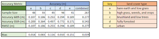
The purpose of this week's lab was to determine the vertical accuracy of DEMs, including determining bias. I was given a high resolution DEM for a section of North Carolina created from LIDAR data and a table of field data of elevation at the ground surface collected using high accuracy survey methods. The table contained 5 land cover types (a-e). The table had coordinates for each point which were converted to a point shapefile using the XY Table to Point tool. The points within the DEM were selected and saved as a separate shapefile for the analysis. To get the values of the raster beneath the points, I used the Extract Multi Values to Points. This tools grabs the elevation value of the pixel in the DEM directly beneath each sample point and then adds a new field to the point shapefile with that value. Because these values were in feet, I added a new field to the attribute table and converted the feet to meters. I then calculated accuracy for each land cover type as well as the...

Module 2.2: Surface Interpolation

Image
In this week's lab, I investigated different surface interpolation techniques using ArcGIS Pro including Thiessen, Inverse Distance Weighted (IDW) and Spline (Regularized and Tension). Each interpolation technique has its advantages and disadvantages and choosing which to use is dependent on the type, number and purpose of the data being used in the analysis. For this analysis, I used a data set of water quality samples taken in Tampa Bay, focusing on Biochemical Oxygen Demand (BOD) in milligrams per liter. The first technique I explored was the Thiessen technique. This interpolation technique assigns an interpolated value equal to the value found at the nearest sample point. It is widely used because it is easy to create, use and interpret. In fact, no GIS software is required for the creation of the polygons. The results in this lab analysis indicate that the statistics generated from the Thiessen technique are almost the same as non-spatial techniques. However, the Thiessen ...

Module 2.1: Surfaces - TINs and DEMs

Image
The purpose of this week's lab was to create 3D visualizations of elevations models, create and modify TINs and compare TIN and DEM elevation  models. Digital Elevation Models (DEMs) are raster based models with information stored as a grid array with topography in equally spaced intervals. Triangular Irregular Network (TIN) models are vector based with elevation points (vertices) as a triangulated surface of overlapping triangles. TINs  also include information about altitude, slope and aspect that can be used to extract and analyze study areas. Which model is most useful in GIS analyses depends on the purpose of the analysis. I explored various TINs and DEMs in this lab but the exercise that demonstrates the differences and similarities between the two models is when I compared the contour lines between a TIN and a DEM created from elevation points. To create the TIN, I used the Create TIN tool with the elevation points as the input using the mass points type and the stu...

Module 1.3: Data Quality - Assessment

Image
For this week's lab assignment, we compared the total lengths of roads for two different road networks: TIGER Roads and Street Centerlines The TIGER Roads shapefile came from the US Census Bureau whereas the Street Centerlines shapefile came from Jackson county, Oregon. The objective was to determine the quality and completeness of the road networks. The total length was used as the simple measure of completeness, assuming that more roads means a more complete network. The first step in the analysis was to determine the total lengths of the roads in each network for the entire county. I used the Project tool to project TIGER Roads into the same coordinate systems as the Street Centerlines shapefile. Then I used the Summarize tool  to determine the total length in each county. The TIGER Roads was found to be longer than the Street Centerlines, thus making it the more complete road network. The second step of the analysis was to determine the total length of the roads within each...

Module 1.2: Data Quality - Standards

Image
In this lab, I explored the concept of data accuracy standards by determined the positional accuracy of road networks. The two sets of road networks were for the city of Albuquerque, New Mexico. One was a shapefile of road center lines from the city of Albuquerque itself and the other was a shapefile with streets from StreetMap USA, a TeleAtlas product distributed by ESRI with ArcGIS software. According to National Standard for Spatial Data Accuracy (NSSDA) guidelines, at least 20 reference points within the study area are needed to test the accuracy of each of the road networks. Additionally, no fewer than 20% of the reference points should be located in each quadrant and the distance between each of the points should be at least 10% of the diagonal distance across the study area. Following the NSSDA guidelines, I divided the study area into 4 quadrants measured the diagonal distance of each quadrant to use in my intersection selection process. To select the reference points, I zo...