Posts

Showing posts from 2019

Internship Portfolio

Image
For the last deliverable of my GIS Internship, I created an official digital Professional GIS Portfolio. I have basic experience developing a website using Word Press and know it can become complicated quickly, so I opted to use Wix because it is a free design host site and the interface is easier to use. For my portfolio, I used many maps created for courses for the Graduate GIS Certificate. I am grateful for the course requirements that required blog posts because this made finding student work examples much easier. It was much more difficult to find examples from my current work position as they are organized into many project folders.  As I was reviewing my work over the past year, I was delighted to see how my final products have improved over time. In addition, it was enlightening to review past course assignments and other work projects, many of which I forgot I completed. Overall, I'm happy with my portfolio and intend to continue to add to it while completing the Ma

Module 5: Unsupervised & Supervised Classification

Image
In this week's lab, I classified satellite imagery using unsupervised and supervised classification methods in ERDAS Imagine. For the supervised classification, I created spectral signatures for 8 classes in Germantown, Maryland using the Region Growing Properties tool, Polygon tool, and the Signature Editor tool. After creating several Areas of Interests (AOIs) for each class, I examined the histograms and mean plots of all the signatures for spectral confusion. Based on the histograms and plots, I concluded that bands 4, 5, and 6 were the most separate and least confused of all the signatures. I used these bands for the supervised classification using Maximum Likelihood. I recoded the supervised image to merge the AOIs into 8 classes and calculated the area in acres for each of the classes. Below is the final result of supervised classification.  Fig 1. Land use map from supervised classification of Germantown, Maryland.

Module 4: Spatial Enhancement, Multispectral Data, and Band Indices

Image
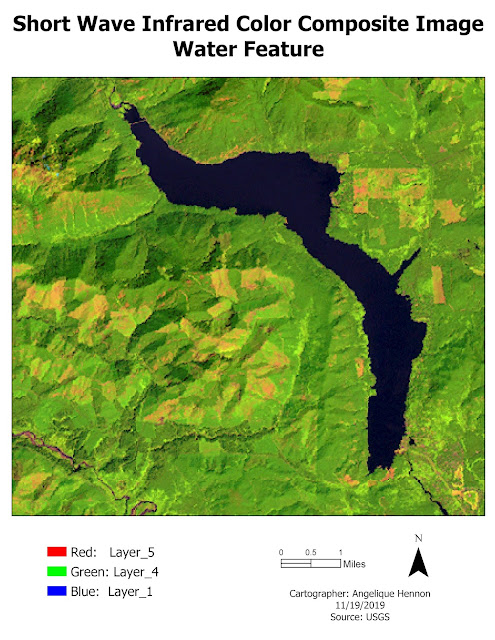
The deliverables for this lab included identifying three features from pixel descriptions on an image in ERDAS Imagine. Grayscale and Multispectral versions of the image were examined using layer histograms and the Inquire Cursor. Once the feature was identified, the Create Subset tool was used to create an image of the area to import into ArcGIS Pro to create the maps. A different multispectral band combination was used for each feature mapped to make that feature stand out. The maps below show each of the features identified in the lab. The water features in the image produced a spike between pixel values of 12 to 18 in Layer_4. To make the feature stand out and identifiable as blue water, Short Wave Infrared Color Composite band combination was selected where dark blue is water, green is vegetation and pink is bare soil. The snow in the image produced both a small spike around pixel value 200 in Layers 1-4 and a large spike between pixel values 9 and 11 in Layers 5-6. To m

Module 3: Intoduction to ERDAS Imagine and Digital Data

Image
In this week's lab, I learned basic tools and functions for exploring imagery in ERDAS Imagine. ERDAS Imagine is pretty similar to ArcGIS Pro in terms of the way the system is setup for navigating and exploring layers, so learning to use the new software was fairly easy. I used ERDAS Imagine to select an area from a classified image of some forested lands in Washington State. Before saving the file, I added a new column with the area in hectares of each cover type in the image. Adding the area column was easier and took fewer steps in ERDAS Imagine than it would have in ArcGIS Pro. I saved the selected area as an .img file and then opened it in ArcGIS Pro to create a map with a legend, including the area of each cover type calculated in ERDAS Imagine. Fig 1. Map of forested land cover types in Washington State derived from a classified image in ERDAS Imagine. 

Module 2: Ground Truthing and Accuracy Assessment

Image
In this week's lab, I practiced feature recognition skills using natural color aerial photography by digitizing an area of Pascagoula, MS to create a land use/land cover map in ArcGIS Pro. To do this, I used a USGS Standard Land Use / Land Cover Classification Scheme and digitized polygons to Level II based on features in the landscape. For each of the classification codes, I developed a guide with recognition elements to aid in the LULC classification. Once the classification was complete, I used the Create Random Sample tool in ArcGIS Pro to create 30 ransom points within the area. I then used Google maps street view to "ground truth" these locations to check the accuracy of my LULC classifications. Fig 1. LULC map of an area of Pascagoula, MS digitized to Level II of the USGS Standard LULC Classification Scheme showing the accuracy of 30 randomly generated ground truthing locations. 

Module 1: Visual Interpretation

Image
The objective of this lab was to learn some of the basic principles of interpreting features found on aerial photographs. In the first exercise, I learned how to identify tone and texture on an aerial photograph. The tone is the brightness or darkness of an area whereas the texture is the smoothness or roughness of a surface. I accomplished the objective by creating 5 polygons for tone and 5 polygons for texture. To interpret tone values for the aerial, I identified and created polygons showing 5 different areas of tone as follows: very light, light, medium, dark and very dark. To interpret texture values, I identified and created polygons showing 5 areas of texture as follows: very fine, fine, mottled, coarse and very coarse.            Fig 1. Map showing a range of values of tone and texture on an aerial photograph. In the second exercise, I learned how to identify features on an aerial photography based on the following 4 criteria: shape and size, shadow, pattern and associ

Module 3.1: Scale Effect and Spatial Data Aggregation

Image
This week's lab used ArcGIS Pro with different data sets to explore the effects of scale on vector data, the effects of resolution on raster data, the effect of the Modifiable Area Unit Problem (MAUP) and measuring gerrymandering using compactness. To explore the effects of scale on vector data, I was given a hydrographic data set that included polylines and polygons at 3 different resolution sizes, 1:1200, 1:24000, and 1:100000. I calculated the total lengths of the polylines and counts, perimeter, and area of the polygons using Statistics. The results of these calculations showed that as scale decreased from 1:1200 to 1:100000, the lengths of lines, counts of polygons, and perimeter and area of polygons decreased. This is because features produced at larger scales have fewer details than those produced at smaller scales. As scale decreases, a larger geographic area is visible with fewer details. Because detail in the map decreases, so too will the details of polygons or lines p

Module 2.3: Surfaces - Accuracy in DEMs

Image
The purpose of this week's lab was to determine the vertical accuracy of DEMs, including determining bias. I was given a high resolution DEM for a section of North Carolina created from LIDAR data and a table of field data of elevation at the ground surface collected using high accuracy survey methods. The table contained 5 land cover types (a-e). The table had coordinates for each point which were converted to a point shapefile using the XY Table to Point tool. The points within the DEM were selected and saved as a separate shapefile for the analysis. To get the values of the raster beneath the points, I used the Extract Multi Values to Points. This tools grabs the elevation value of the pixel in the DEM directly beneath each sample point and then adds a new field to the point shapefile with that value. Because these values were in feet, I added a new field to the attribute table and converted the feet to meters. I then calculated accuracy for each land cover type as well as the

Module 2.2: Surface Interpolation

Image
In this week's lab, I investigated different surface interpolation techniques using ArcGIS Pro including Thiessen, Inverse Distance Weighted (IDW) and Spline (Regularized and Tension). Each interpolation technique has its advantages and disadvantages and choosing which to use is dependent on the type, number and purpose of the data being used in the analysis. For this analysis, I used a data set of water quality samples taken in Tampa Bay, focusing on Biochemical Oxygen Demand (BOD) in milligrams per liter. The first technique I explored was the Thiessen technique. This interpolation technique assigns an interpolated value equal to the value found at the nearest sample point. It is widely used because it is easy to create, use and interpret. In fact, no GIS software is required for the creation of the polygons. The results in this lab analysis indicate that the statistics generated from the Thiessen technique are almost the same as non-spatial techniques. However, the Thiessen

Module 2.1: Surfaces - TINs and DEMs

Image
The purpose of this week's lab was to create 3D visualizations of elevations models, create and modify TINs and compare TIN and DEM elevation  models. Digital Elevation Models (DEMs) are raster based models with information stored as a grid array with topography in equally spaced intervals. Triangular Irregular Network (TIN) models are vector based with elevation points (vertices) as a triangulated surface of overlapping triangles. TINs  also include information about altitude, slope and aspect that can be used to extract and analyze study areas. Which model is most useful in GIS analyses depends on the purpose of the analysis. I explored various TINs and DEMs in this lab but the exercise that demonstrates the differences and similarities between the two models is when I compared the contour lines between a TIN and a DEM created from elevation points. To create the TIN, I used the Create TIN tool with the elevation points as the input using the mass points type and the study ar

Module 1.3: Data Quality - Assessment

Image
For this week's lab assignment, we compared the total lengths of roads for two different road networks: TIGER Roads and Street Centerlines The TIGER Roads shapefile came from the US Census Bureau whereas the Street Centerlines shapefile came from Jackson county, Oregon. The objective was to determine the quality and completeness of the road networks. The total length was used as the simple measure of completeness, assuming that more roads means a more complete network. The first step in the analysis was to determine the total lengths of the roads in each network for the entire county. I used the Project tool to project TIGER Roads into the same coordinate systems as the Street Centerlines shapefile. Then I used the Summarize tool  to determine the total length in each county. The TIGER Roads was found to be longer than the Street Centerlines, thus making it the more complete road network. The second step of the analysis was to determine the total length of the roads within each

Module 1.2: Data Quality - Standards

Image
In this lab, I explored the concept of data accuracy standards by determined the positional accuracy of road networks. The two sets of road networks were for the city of Albuquerque, New Mexico. One was a shapefile of road center lines from the city of Albuquerque itself and the other was a shapefile with streets from StreetMap USA, a TeleAtlas product distributed by ESRI with ArcGIS software. According to National Standard for Spatial Data Accuracy (NSSDA) guidelines, at least 20 reference points within the study area are needed to test the accuracy of each of the road networks. Additionally, no fewer than 20% of the reference points should be located in each quadrant and the distance between each of the points should be at least 10% of the diagonal distance across the study area. Following the NSSDA guidelines, I divided the study area into 4 quadrants measured the diagonal distance of each quadrant to use in my intersection selection process. To select the reference points, I zo

Module 1.1: Calculating Metrics for Spatial Data Quality

Image
In this lab, we determined the precision and accuracy measurements of provided GPS waypoint data, as well as the root-mean-square error (RMSE) and cumulative distribution function. For geospatial data, precision is how close measurements are to one another, while accuracy is how close the measurement is to the actual - or reference - value. Data can be precise without being accurate and vice versa. GIS data is held to specific accuracy and precision limits and the values are represented as differences, or errors, where accuracy is usually met with the RMSE as a guide.  For this lab assignment, the precision was determined as a distance (in meters) that accounted for 68% of the observations; while the accuracy was determined by measuring the distance between the average and accepted reference points. In both cases, the larger the value, the lower the precision and accuracy.  The result for horizontal precision within 68% of the average waypoint is 4.4 meters, which puts most

Module 6: Damage Assessment

Image
The purpose of this lab was to perform a post Hurricane Sandy damage assessment on structures within a study area in New Jersey. I began by performing a raster mosaic with pre- and post-Sandy imagery. With these mosaics added to a map, the Flicker and Swipe tools could be used to examine the structures pre- and post-Sandy.  I created a new point feature class for the damage assessment and created attribute domains for the analysis. Using domains helps assessments such as this one by ensuring data integrity because they limit value choices for each field. In addition, once the domains are created, a form can be created to use with ArcGIS Collector which is an app can be used in the field for a thorough damage assessment. Below is a screen capture of the domains I created with the Codes and Descriptions of the Structure Damage domain visible. I then performed my damage assessment by locating and identifying attributes based on storm damage.  I zoomed into the Ocean County Parce

Module 5: Coastal Flooding

Image
The purpose of this module was to explore procedures for coastal flooding and storm surge analyses using elevation models, overlay analyses for vectors and rasters, and spatial queries. The first data set was for an area in New Jersey that was impacted by Hurricane Sandy. I converted LAS files from pre- and post- Sandy for the coastline area were to TINs and then rasters. I subtracted the two rasters from each other using the Calculate Raster tool and analyzed the resulting shapefile was for damage with a 2019 building overlay. There are several areas in the study area that show significant erosion (red areas) that have not been rebuilt. The map below shows the overall results of this analysis. The second data set was also for New Jersey. A DEM was provided and I reclassified it into areas that would flood based on the Hurricane Sandy storm surge of 2 meters. I then converted the raster to a polygon and examined the result for Cape Map County. Based on the analysis, about 52% of C

Module 4: Crime Analysis

Image
The purpose of this week's lab was to explore 3 selected hotspot mapping techniques for crime analysis for 2017 homicides in the Chicago area. The results of each technique were compared against 2018 homicide data to assess each technique's reliability for predicting crime. The first technique was Grid Overlay Hotspot Analysis. The goal was to determine the number of 2017 homicides in each grid cell and select the cells with the highest count. This was accomplished by first performing a spatial join between the 1/2 mile grid cells and the 2017 homicide data which added a field representing the number of homicides in each grid. I then used the Select by Attributes tool to select all counts greater than 0 and saved the selection as a separate feature class. I selected grids with the top 20% manually from the attribute table - the total number selected was calculated by dividing the total by 5 - and saved the selection as a separate feature class. To dissolve this feature class,

Module 3: Visibility Analysis

Image
The purpose of this week's lab was to complete 4 ESRI trainings to explore the concepts of line of sight analysis, viewshed analysis, 3D visualization and sharing 3D content. The first training, 3D Visualization Using ArcGIS Pro was concerned with creating and navigating 3D scenes. 3D maps and scenes can be helpful for visualizing and analyzing data in a more realistic setting. Investigating data in 3D allows a different perspective in order to gain different and new insights that might not be answerable in a 2D setting. Applications for 3D maps are many and include showing the impact of a new building in an area, displaying a transportation route through an area, or visualizing subsurface features such as wells, pipelines or fault lines. Although 3D maps have wide ranging applications, navigating them can be initially cumbersome and sometimes difficult to interpret, depending on the data being displayed. In this training, I explored data for Crater Lake in Oregon, and San Diego,

Module 2: Forestry and LiDAR

Image
The purpose of this week's lab was to find and use LiDAR data in an analysis to calculate forest height and biomass. The original .las LiDAR file was acquired from the Virginia LiDAR online application (https://vgin.maps.arcgis.com/home/index.html). The LiDAR Download Grid: N16_5807_20 was downloaded and decompressed using an LAS Optimizer from ESRI. The DEM and DSM were created from the LiDAR layer by changing the appearance to Ground and Non Ground, respectively, using the LAS Dataset to Raster tool in ArcGIS Pro using a sampling value of 6. The original LiDAR scene and derived DEM are below. To create a forest or tree height layer, the DEM and DSM were used as inputs in the Minus tool in ArcGIS Pro. A tree height distribution chart was created with data from this layer. The chart shows the total count of tree of different heights. It approximates a normal distribution bell curve ranging from -5 (an error value) to 163 feet, with an average of 54 feet. Most of the tree heigh

Module 1, Part 2: Corridor Analysis

Image
The purpose of this lab was to create a corridor of potential movement of black bears between two protected areas in the Coronado National Forest. The variables for the analysis included distance to roads, elevation and land cover. The flow chart for the work flow in this analysis is below: In order to begin the corridor development, I first developed a habitat suitability model. I began by  reclassifiying the roads shapefile and elevation and landscape rasters. The rasters were reclassified using the Reclassify tool with the cost values provided. The roads shapefile was first converted to a raster using the Polyline to Raster tool, then using the Euclidean Distance tool to identify distances away from the road within the elevation raster’s extent, then using the Reclassify tool with the cost values provided. The habitat suitability model was then developed using the Weighted Overlay tool with all three reclassified rasters, weighted with landcover at 60% and elevation and roads a